Pages

Monday, February 13, 2012

Sharing about chinese-islamic calligraphy art in china

The arrival of islam to China  was via merchants and sailors entering through GuangDong and fujian and also bringing the muslims to China through northwest via Silk Road. And so great cultural influx benefited China by the foreign art, new ideas and religions and new lifestyles.

And there it started Chinese Islamic calligraphy.'Sini' is a Chinese Islamic calligraphic form for the Arabic script. In the Islamic world it takes the place of iconography, being widely used in the decorative schemes of buildings, scrolls, ceramics, Quran, pottery and many more.


Scrolls


 * Verses from the Qur’an are shown in the form of a mihrab, or prayer niche.

 * Arabic calligraphy is shaped into the popular Chinese character for “longevity.” in China


 * The Chinese islamic Script which form the shape of dish and sword, contain phrases of  Quran.

* These scrolls were normally hung as a set in Chinese islamic homes. 


Porcelain


 * Impaired by the Persian art, Chinese potters began to decorate their wares with Islamic inscription.


Quran
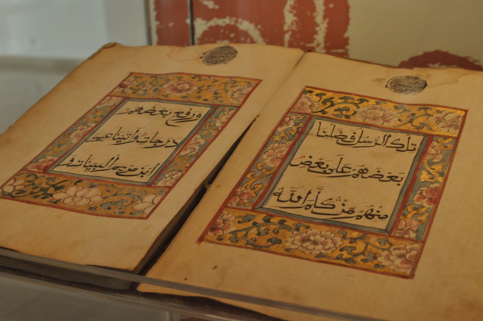


* Quran in China

Design Method 3 - Project 2 field trip

1. The initial statement of IAMM is to conserve, preserve and propogate the knowledge of islamic art & culture.

2. The audiences get to know more in depth about islamic art & culture from around the world. By walking through all the galleries, audiences would also get to see how's the development process of the artworks from olden ages. There are many artifacts that look very unique in their design and sculpture such as flyswatter from india. We didn't know that it's a flyswatter until we read the information. I think that this was a good experience for us to explore more interesting idea and design.


3.The architectural style of the museum is modern and the Islamic design is imparted through details. The flow of light from the big windows that surround the musuem and big space that retain throughout the whole musuem make it an airy and harmonious ambience.What caught my eyes is the inverted domes on the ceiling, they are beatifully design and sculptured with islamic patterns and geometry shapes. What can be improve in the musuem is the information of some artifacts are not display and some lighting could be better because some lightning of artifacts are quite dark and people could hardly see the details of the artifacts.


4. The lifestyle and practice of marriage of people in central asia and how important is jewellery to them?

As what i got from research, Community in central asia were categorized into settled and unsettled urban communities and jewellery are the things that marked the social status of a person. Unlike the lifestyle of settled urban communities, the lifestyle of unsettled one were brutal and there happened aridity of landscapes and intertribal warfare. Due to the unsettled nature of lifestyle, all their possessions had to be portable.So they stored their wealth in the form of jewellery. Jewellery also represents important life events like birth, coming of age and marriage.The practice of marriage in central asia is unique too, they needed to wear jewelleries like bridal crown, belt bucket, pectoral plate and many more along the day until the end of ceremony. These jewelleries were very heavy as they are pure silver, gold and brass ornamentation and they were scuptured in details and beautifully designed.


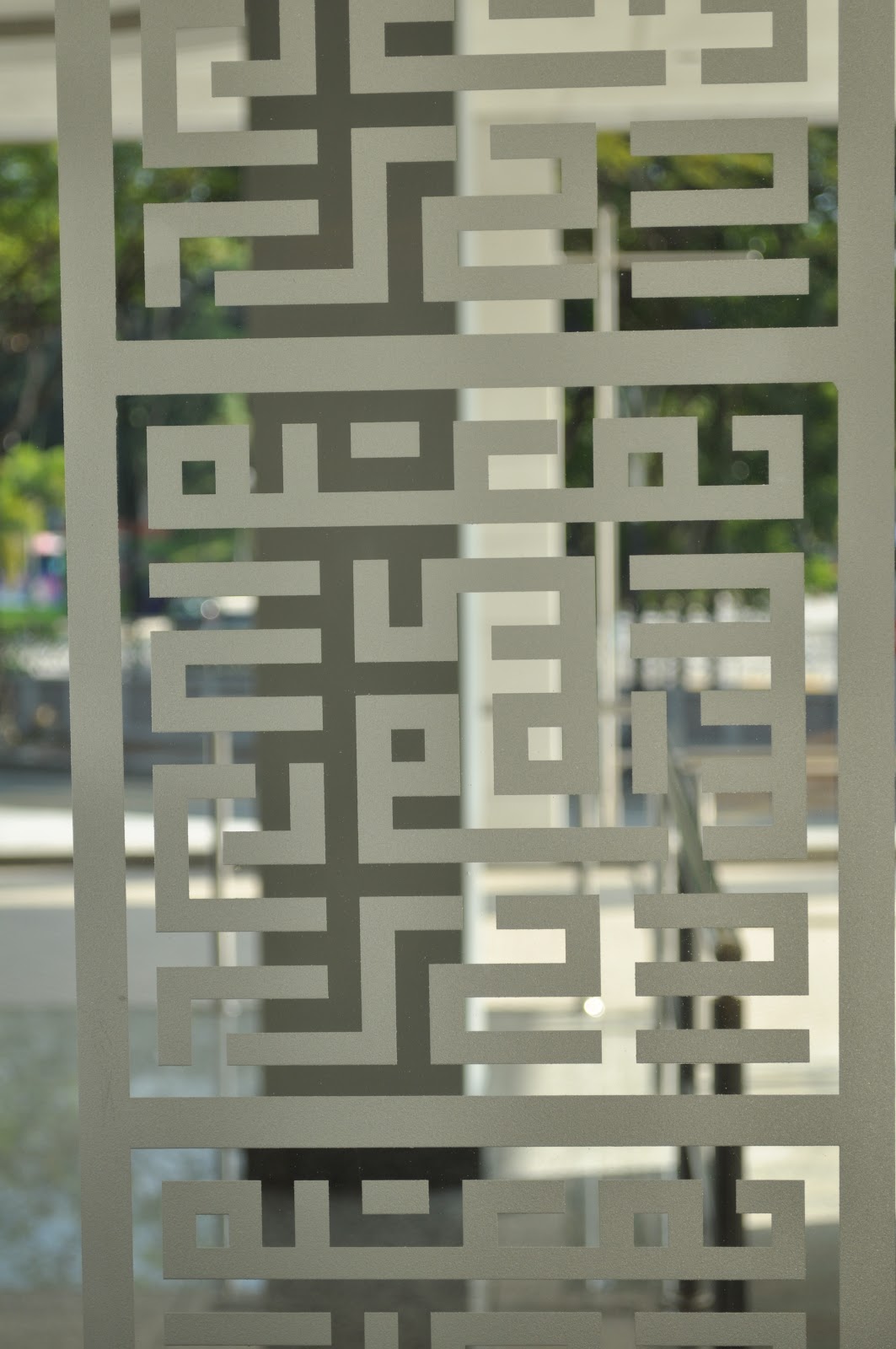
5. The impression that I have towards Islamic Art is the floral patterns shapes in the interior design of the musuem and logo of IAMM which is in the pattern of square kufic, arabic words with the meaning of islamic art of musuem.


Questions1: What does the floral pattern symbolize in islamic art? Why is it used?
Questions2: Why is there don't have any images of human in islamic art?
Questions3: How does islamic art built?
Questions4: Why do people use animals parts(e.g. tiger's teeth)to make weapon?
Questions5: How does islamic art come into china?

Monday, September 12, 2011

WD2 -Gantt Chart & sitemap

Gantt Chart


Sitemap

WB2 - Tutorials

HTML Code Tutorials

Design tutorials

WB2 - Beautiful Websites

Analysis: It looks very clean yet classy and elegant. Font type used is nice and suit the theme. The use of the black box at side bottom of the slide show is good as it is to highlight the important point and it looks .organized and professional.

Analysis: First of all, the logo attracts me the most in the first sight. The hierachy is good and the information is arranged  neatly. The treatment of the subtitle is nice and interesting. Usage of fancy font for the subtitle and subhead brings out the feeling and fashion and fun. i like the created vector icons and texture of jeans is used.


Analysis: The very first thing that attracts me is the illustration. As it is a portfolio website for a film animation school so there's animation being used and the whole webpage is in illustration artstyle. Navigation button is cute and the title is clear and the treatment is interesting as it's playing with the space and different font type.Navigation is clear.


Analysis: The overall feeling towards this website is clean and classy. It's easy to navigate as the next and back buttons allow you to see the well organized informations in the box 1 by 1. I like the way they show the informations and how they arranege the hierachy.Font type used is suitable and comfortable to be read.
http://www.olliemccarthy.com/themes/VenturaLive/?transparent_layer=Header-Rays.png

WB2 - (YTL)Lake edge's Competitor websites

1) Mah Sing group - OneLegenda
Analysis: The font is quite hard to be read. I think overall design feeling does not suit the type of the property. The whole chunk of text does not attract the viewer to read it. However it's user friendly and i like the floorplan selection effect in Design& features - typesA,B,C 

2)Gamuda Land
 Analysis: Interesting and nice Art direction - Retro and classy kind of artstyle and feeling. But somehow i feel it's a bit too heavy for a properties website. There's lots of nice effects in this flash based website, so the loading part take some times to be loaded.

3)ioi property - Bandar puteri Puchong
Analysis :I think the font used for the navigation bar is a bit too fancy and the webpage would look nicer if the frame place in center. The information should be arranged in hierachy or summarized if it's too long so that the reader wouldn't get bored so easily.

4)Mah Sing - Garden Residence
Analysis: The menu bar is not so user friendly as in sometimes i find it hard to make the menu bar to scoll down. It's simple yet informative and clean. i find it comfortable to browse through the pages and the informations are arranged well and the hierachy is quite well done.

Tuesday, May 31, 2011

DGM 2

Title: Spring show and sale ( offline & online media ) 


Title : Clorets (offline media)

Title : Bose (offline media - poster)


Title : Dark smoke (offline)


Title : Glass recycle campaign (Online- video) 


Tuesday, May 17, 2011

Ideas on project 1 for Web Design1: How to....?

Title : how I prepare a memorable and romantic marriage proposal

1. WHO AM I             : Author
2. WHO IS SHE          : Girl friend
3. WHAT FOR            : Marriage proposal
4. 1st task                    : choosing ring & flower
5. 2nd task                   : Decorating the restaurant
6. 3rd task                   : Different ways to propose
7. OUTCOME            : Successful proposal
8. SHOWCASE          : Gallery


Title : how to be prepared for exam

1. WHO AM I             : Teacher
2. WHO IS SHE/HE    : Students
3. WHAT FOR            : Get good result in exam
4. 1st task                    : Never fear or hate exam and be confident.( throw away negative words in brain )
5. 2nd task                   : Environment in the study room (keep away things that distract you e.g. Television)
6. 3rd task                   : Eat the right food and drink plenty of water ( choose the right drink and food )
7. 4th task                    : Other minor preparation list
8.  OUTCOME           : Good/ satisfied result   


Title : how to prevent from snatch thieves

1. WHO AM I             : Author /  Police
2. WHO IS SHE/HE   : Citizens
3. WHAT FOR            : Safety of the citizens
4. 1st task                    : Identify anyone suspicious
5. 2nd task                   : How to prevent (e.g. place your bag/laptop bag under the car seat)
6. 3rd task                   : How to react when get snatched
7. OUTCOME            : Less snatch thieves
8. SHOWCASE          : Gallery

Monday, May 16, 2011

Photoshop tutorials

These are some of the photoshop & illustrator tutorials which i think it's interesting. =)


Beautiful Websites

i love the artstyle used in this webpage which is pop up. The colour used and effects are interesting too =P  


it uses the concept of space to create the feeling of this webpage. i like the colours used and the graphics attract my attention =)


The art direction is beautiful and i like the loading page animation =P the effects used are nice and intresting too =)

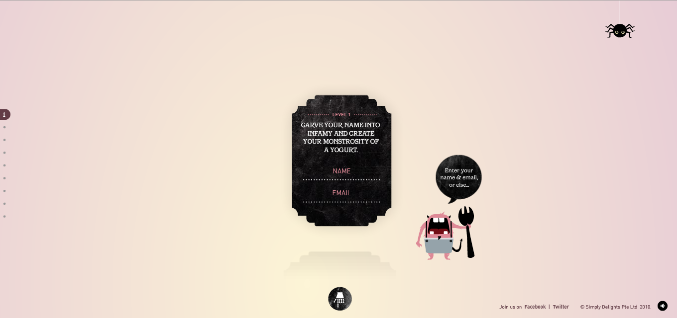
 i like the art direction of using blackboard for background and the typo written with chalk.

Saturday, November 13, 2010

birthday e-greeting card interface design- bathroom theme =D


3 LOADING PAGES


 10 % - water level will keep increasing while the percentage is increasing also. and the dog is chasing after the little yellow duck in the water.lol

 50%- this is the water level when the percentage reaches 50. the dog is still keep chasing after the duck lol.
 100% -the dog caught the duck successfully with a smiley face =D
 the first page- my main character doggie and the tittle

 MY CLEAN DAY
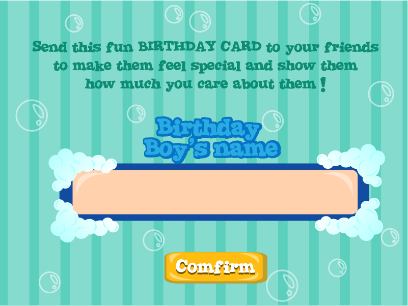
 second page- enter name of the birthday boy.
 a SPA voucher as a gift for your friend.
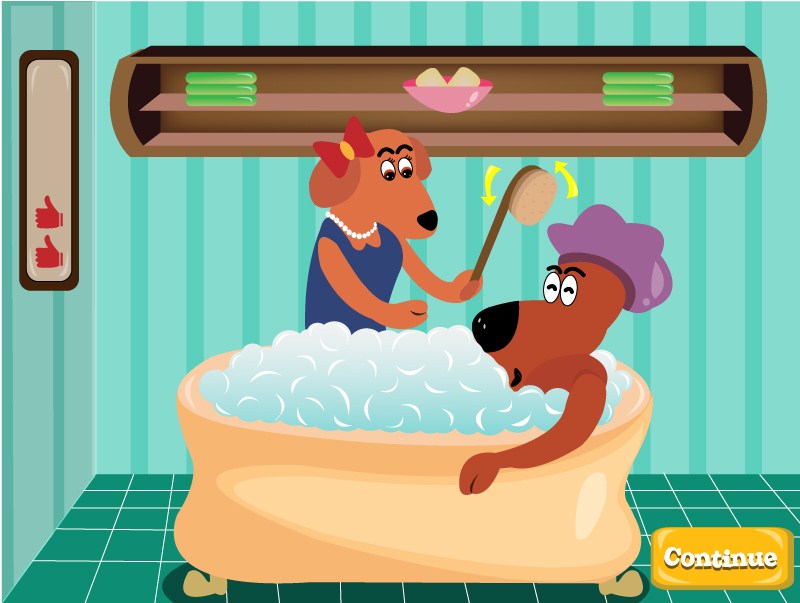
 the first game- a pretty bitch holding a brush to brush the doggie body. move your mouse up and down and the brush will automatic brush the doggie until the bar at the left hand side full with thumbs up and the button will pop up and you may continue the next game. there are 3 more games to play but due to time given is limited and we are constructed to design 5 interface design only so the rest i will continue to do during sem break =D hehe
so this is the last page- with 2 pretty bitches accompanying the birthday boy to celebrate his birthday =D